
Introduction

Mobile Responsiveness became necessary due to Modern internet users browse websites from smartphones, tablets, laptops, smart TVs, and even foldable devices. A website that looks perfect on a desktop but breaks on a mobile phone can lose visitors, sales, and search rankings. This is where Mobile- Friendly Website becomes essential.
In 2026, Mobile- Friendly Website is no longer optional. It is the foundation of user experience, search engine optimization, lead generation, conversions, and website credibility. Whether you run a blog, business website, eCommerce store, or portfolio, understanding Mobile- Friendly Website is critical for online success.
What is Mobile Responsiveness?
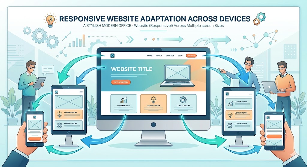
Mobile responsiveness is the ability of a website to automatically adjust its layout, images, content, and navigation according to the screen size and device being used.
A responsive website ensures that users can easily read content, click buttons, fill forms, and navigate pages without zooming or horizontal scrolling.
Key Features of Mobile- Friendly Website
- Flexible layouts
- Responsive images
- Readable text
- Touch-friendly buttons
- Fast loading speed
- Device compatibility
- Improved navigation
The goal is to create a seamless experience across all devices.
Why Responsive Web Design Matters in 2026
More than half of global web traffic comes from mobile devices. Search engines prioritize mobile-friendly websites because they provide better experiences to users.
Benefits include:
Better User Experience
Visitors stay longer when content is easy to read and navigate.
Improved Search Rankings
Search engines evaluate mobile usability when determining rankings.
Higher Conversion Rates
Responsive websites help users complete purchases, inquiries, and registrations more easily.
Lower Bounce Rate
Visitors are less likely to leave when pages display properly.
Increased Brand Trust
Professional mobile experiences create confidence among users.

Why Responsive Web Design is the Backbone of All Website Elements
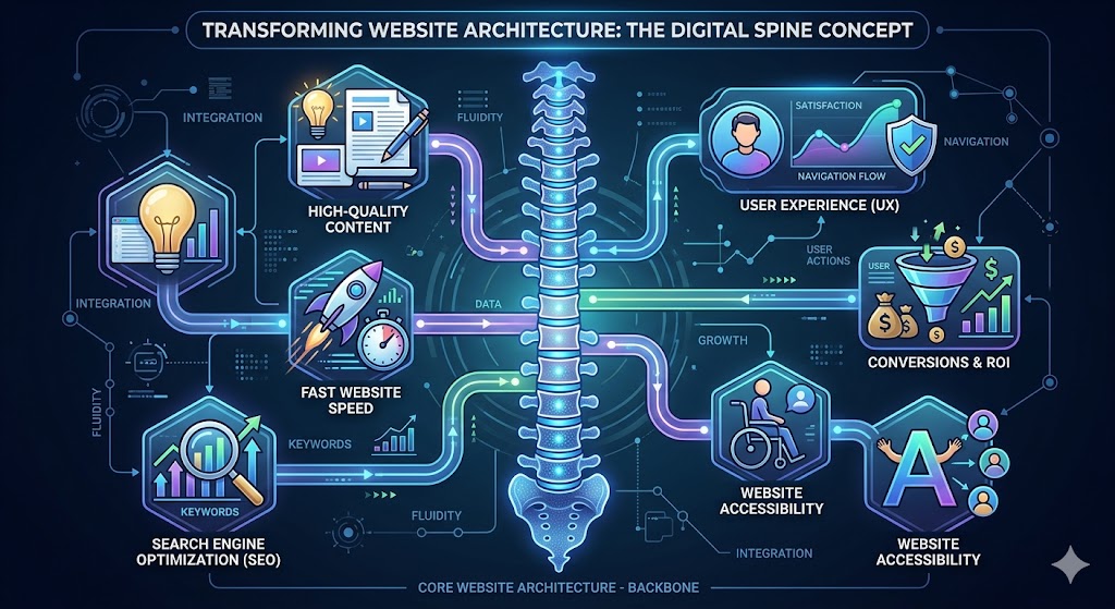
Think of a website as a human body.
- Content is the brain.
- SEO is the nervous system.
- Design is the appearance.
- Speed is the heartbeat.
Mobile SEO is the backbone that supports everything.
Without Mobile SEO :
- SEO performance suffers.
- User experience declines.
- Conversions decrease.
- Engagement drops.
- Website speed issues become more noticeable.
Every important website element depends on responsive design.
Content
Even excellent content becomes difficult to consume if it is unreadable on mobile devices.
SEO
Search engines evaluate mobile usability before rewarding rankings.
User Experience
Responsive layouts improve visitor satisfaction.
Conversion Optimization
Forms, buttons, and checkout pages work better across devices.
Core Web Vitals
Responsive websites often perform better in speed and usability metrics.
Essential Components of Mobile -Friendly Website
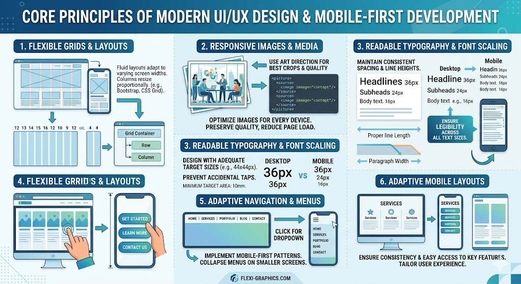
1. Flexible Grid Layouts
Responsive websites use percentage-based layouts instead of fixed widths.
Benefits:
- Adapts to different screens
- Prevents content overflow
- Improves readability
2. Responsive Images
Images automatically scale according to screen size.
Benefits:
- Faster loading
- Better visual quality
- Reduced bandwidth usage
3. Mobile-Friendly Navigation
Navigation menus should remain simple and accessible.
Common solutions:
- Hamburger menus
- Sticky navigation
- Collapsible menus
4. Readable Typography
Text should be comfortable to read on smaller screens.
Best practices:
- Clear font styles
- Proper spacing
- Appropriate font sizes
5. Touch-Friendly Buttons
Mobile users interact with fingers instead of mouse pointers.
Buttons should:
- Be large enough to tap
- Have sufficient spacing
- Remain visible on all devices
Mobile – Friendly Website and SEO
A strong mobile experience directly supports search engine optimization.
Faster Loading Pages
Responsive design improves page performance.
Improved Crawlability
Search engines can easily understand responsive websites.
Better User Signals
Positive engagement metrics support SEO efforts.
Mobile-First Indexing
Search engines primarily analyze mobile versions of websites.
For this reason, Mobile Responsiveness and Mobile SEO work together to improve visibility.

Common Mobile – Friendly Website Mistakes
Using Fixed Width Layouts
Content may overflow on smaller screens.
Large Unoptimized Images
Heavy images slow page loading.
Tiny Clickable Elements
Small buttons frustrate mobile users.
Pop-Ups Blocking Content
Intrusive pop-ups create poor experiences.
Ignoring Tablet Optimization
Responsive design should support tablets as well as smartphones.
How to Test Mobile – Friendly Website
Several tools help evaluate responsiveness.
Google PageSpeed Insights
Measures mobile performance and user experience.
Browser Developer Tools
Simulate various screen sizes.
Real Device Testing
Always test on actual smartphones and tablets.
Mobile-Friendly Audits
Identify layout and usability issues quickly.
Regular testing ensures a consistent user experience.
Best Practices for Responsive Web Design in 2026
- Design mobile-first.
- Compress images.
- Improve page speed.
- Use responsive frameworks.
- Optimize navigation.
- Reduce unnecessary scripts.
- Test across multiple devices.
- Focus on user experience.
- Monitor Core Web Vitals.
- Update design regularly.
Following these practices helps maintain a truly mobile-friendly website.
Future of Responsive Web Design
The future includes:
- AI-driven adaptive layouts
- Foldable device optimization
- Voice-first experiences
- Faster mobile browsing
- Enhanced accessibility standards
Websites that prioritize Responsive Web Design today will remain competitive tomorrow.
The Future of Responsive Websites in 2026 and Beyond
The digital landscape continues to evolve rapidly. Websites are no longer viewed only on desktops and smartphones. Users now access online content through foldable phones, smart watches, tablets, smart TVs, vehicle infotainment systems, and voice-enabled devices.
Several trends are shaping the future of responsive web development:
AI-Powered Adaptive Interfaces
Artificial intelligence is helping websites automatically adjust layouts, content placement, and navigation based on user behavior and device type. Instead of showing the same design to every visitor, websites can create personalized experiences.
Benefits
- Better engagement
- Higher conversion rates
- Improved accessibility
- Personalized user journeys
Foldable Device Optimization
The growing popularity of foldable smartphones requires websites to adapt dynamically when screen dimensions change during usage.
Businesses that optimize for foldable screens will gain a competitive advantage as adoption increases.
Voice Search Integration
More users are performing searches through voice assistants.
Responsive websites increasingly focus on:
- Conversational content
- Faster loading times
- Structured data implementation
- Featured snippet optimization
Accessibility-First Design
Future websites must serve users of all abilities.
Important considerations include:
- Screen reader compatibility
- Keyboard navigation
- Color contrast optimization
- Alternative image descriptions
Accessibility improvements often improve SEO and user satisfaction simultaneously.
Faster Web Experiences
Modern visitors expect websites to load almost instantly.
Future-ready websites focus on:
- Image compression
- Efficient coding
- Content delivery networks
- Reduced server response time
Speed remains one of the strongest ranking and conversion factors.

Complete Responsive Website Audit Checklist for 2026Use this checklist to evaluate your website.
Design & Layout
✔ Layout adjusts to all screen sizes
✔ No horizontal scrolling
✔ Consistent spacing throughout pages
✔ Proper content alignment
✔ Responsive columns and sections
Navigation
✔ Mobile menu functions correctly
✔ Navigation remains easy to access
✔ Internal links work properly
✔ Breadcrumb navigation available
✔ Search feature accessible
Typography
✔ Text is readable without zooming
✔ Proper line spacing
✔ Consistent heading hierarchy
✔ Clear font choices
✔ Adequate contrast ratio
Images & Media
✔ Images resize automatically
✔ Images are compressed
✔ Videos display correctly
✔ No broken media files
✔ Alternative text added
Performance
✔ Fast loading speed
✔ Optimized CSS and JavaScript
✔ Browser caching enabled
✔ Core Web Vitals passing
✔ Minimal unnecessary plugins
SEO
✔ Mobile-first indexing compatible
✔ Structured data implemented
✔ XML sitemap updated
✔ Canonical tags configured
✔ Internal linking strategy active
User Experience
✔ Contact forms function properly
✔ Buttons are easy to tap
✔ Checkout process works smoothly
✔ Pop-ups do not block content
✔ Important information remains visible

Frequently Asked Questions
What is the difference between responsive design and mobile-friendly design?
A mobile-friendly website works on smartphones, while responsive design automatically adapts layouts to different screen sizes and resolutions. Responsive design provides a more consistent experience across devices.
Why do search engines prefer responsive websites?
Search engines prioritize websites that provide better usability, faster loading times, and easier navigation across devices. These factors contribute to stronger rankings.
Can a responsive website improve conversions?
Yes. Visitors are more likely to complete purchases, submit forms, or contact a business when navigation and content are easy to use on any device.
Does responsive design affect website speed?
Proper implementation can significantly improve loading performance through optimized layouts, compressed images, and efficient resource management.
Is responsive design important for local businesses?
Absolutely. Most local searches now occur on smartphones. A poor mobile experience can result in lost leads and sales opportunities.
How often should responsiveness be tested?
A complete audit should be performed every three to six months and whenever major website updates are made.
Conclusion
Mobile Responsiveness is one of the most important website foundations in 2026. It supports SEO, user experience, website performance, conversions, and brand credibility. Every modern website should adopt responsive web design principles to ensure users enjoy a seamless experience regardless of device.
By focusing on responsive web design, mobile SEO, website user experience, and performance optimization, businesses can achieve stronger rankings, greater engagement, and higher conversion rates.
In simple terms, if SEO drives visitors to your website, Mobile Responsiveness ensures they stay, engage, and convert.